


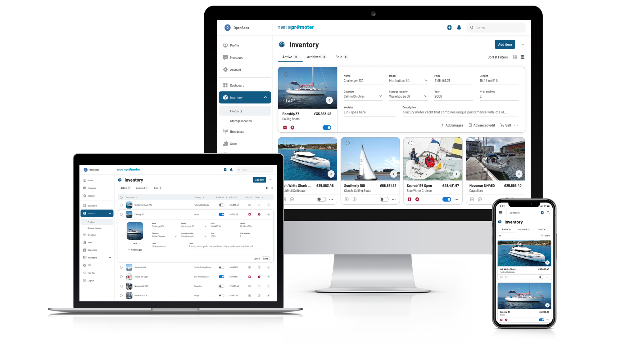
Promoter is a powerful stock management and advertising tool designed to help businesses effectively manage their inventory and ads across multiple marketplaces. With Promoter, user can easily handle client inquiries and even create a professional website that feeds their ads directly from the platform.
The objective was to come up with an umbrella brand that could be used in conjunction with customised logos for specific niches and still be unique enough for each one. Additionally, we developed a design system that can be utilised throughout the platform, providing a cohesive and intuitive user experience.
For this branding, we focused on the idea of "promotion" as the process of enhancing something's impact to broaden its appeal and audience. We were inspired by this concept to create a logo that represents the product's goal of improving the exposure and awareness of the companies using it by assisting them in promoting their goods, which would raise both their online presence and performance.
The Promoter logo serves as the primary umbrella brand for all of the platform's niche offerings. In addition, there is a unique logo for each niche that is customised with its own colour and specific design elements.
The Promoter logo is a distinctive wordmark that features a stylised letter "o" which represents the concept of promotion and putting something forward. The "o" is designed as a circle with a subtle shadow, adding depth and dimension to the logo. This unique design element symbolises the platform's mission to help businesses enhance their impact and broaden their audience through effective advertising and inventory management.


To ensure that logos are clearly visible, surround them with clear space that is free of type, graphics, and other elements that might cause visual clutter. Use the x-height of the logo wordmark to determine minimum clearance around the logo.

Colour plays a significant role in the design of each niche logo. For each niche, we carefully selected a colour that represents the unique qualities of the brand. Each niche logo has a primary colour, a secondary colour, and a linear gradient made from the combination of the two colours.

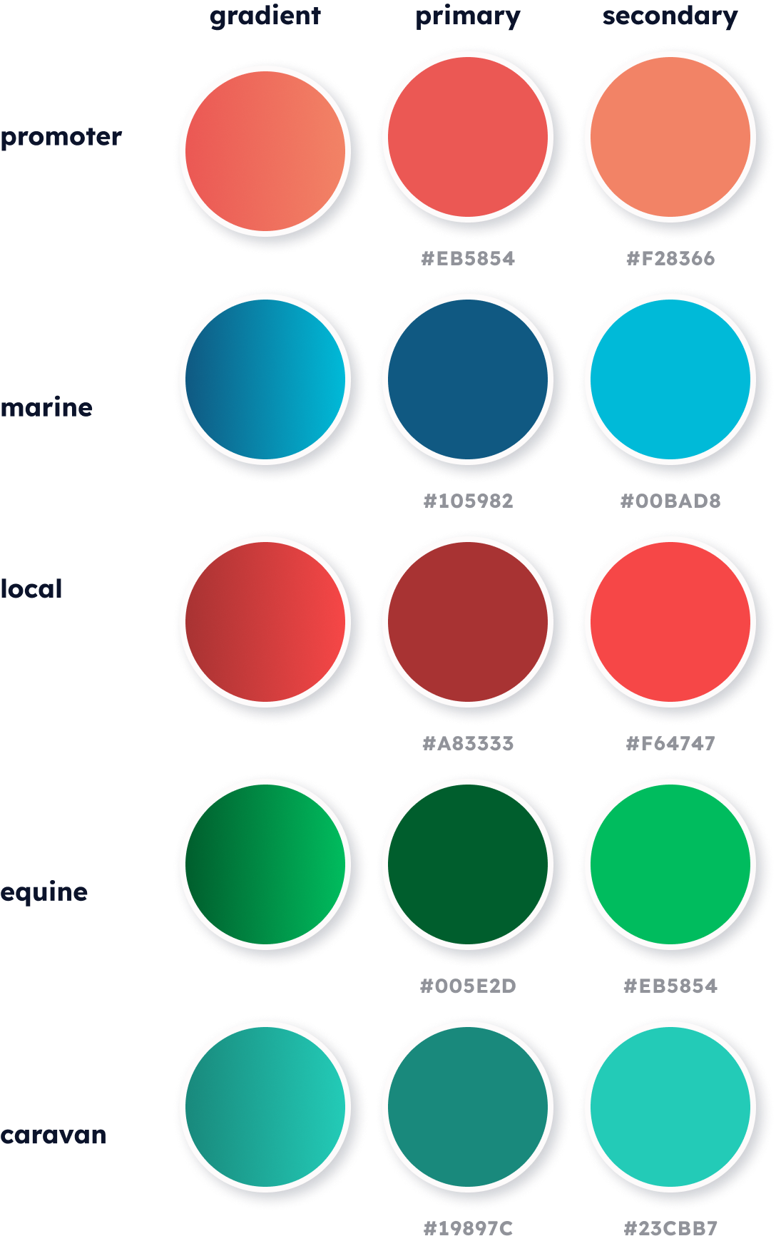
We also selected a colour palette for the interface text, borders, surfaces, tags, and user avatars. The colours we chose complement the overall Promoter branding and provide clear visual cues to help users navigate the platform. By using a consistent colour palette, we created a cohesive and intuitive user experience.


We choosed Barlow as the main typeface for this brand. Barlow is a grotesque sans serif font with a good balance of friendly and functional, like Promoter. Due to its many weights and styles ranging from Thin100 to Black900, Barlow can support complex hierarchies making it perfect for our product as it will work both in the platform and on any marketing materials.


The Promoter app is a tool for professionals to be more productive and stay on top of their business. Our communications and platform are designed to be simple, clean, and clear, so users can find what they need easily. All the information we provide is direct and easy to understand so they can make decisions quickly without feeling overwhelmed.

We built a UI button library for consistent branding throughout our app, ensuring a unified visual experience. This process allows our team to focus on critical aspects of the user interface, enhancing user engagement and reinforcing our brand's presence.


Our iconography and illustrations are designed to capture the essence of the product in a minimalist and elegant style. Outlines play a central role in this approach, with colour used sparingly to highlight important elements. This minimalist design language ensures that the user interface remains clean and uncluttered, while important information is clearly communicated.


Having a consistent branding and UI system has helped develop the app faster and create consistency across the entire platform, which will help make future updates easier to implement. It has also allowed us to build a user-friendly environment that is easier for users to navigate as we continually update our product.
Building a brand from the ground up and designing a system that fits our users through a variety of highly specific niches was the difficulty of this project. In order to succeed, we discovered that it was essential to understand who our potential users were, what their needs were, and how our software could meet those demands in so that they could be more productive right away.