


The goal of this project was to create a visual identity, including both naming and branding, for a new boxing club focused on boxing, muaythai and kickboxing K1. The club offers group and individual training sessions for all levels that can take you from beginner to a professional level, being the owner himself a K1 champion. The members learn how to defend themselves and become stronger in all ways possible, learning to master their body, mind and life. They learn how to fight, but also how to have a better and more positive lifestyle.
We wanted a name that describes boxing as something basic that comes from inside us all as humans, but also something powerful because it takes us to another level of self-improvement and development as human beings. It also needed to represent the club mission: to help its members evolve into better versions of themselves.
With all this in mind it was clear that the concept that best represented was “evolution”. This concept is well known by the public and has already many ideas attached to it that align with the core message: “survival of the fittest”, “science”, “powerful dinosaurs” and “growth”. From that moment, Evolution Boxing Club was born and ready to evolve from a one person’s dream into a reality.

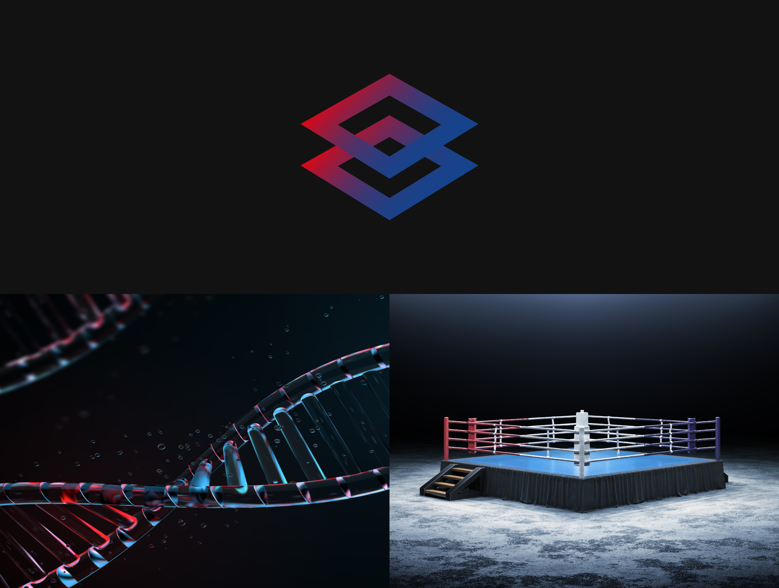
The symbol is inspired in two strong concepts. The first one is a DNA string, which represents the idea of evolution and adaptation, that even though we have our own genetic code, we can change it through good nutrition, exercise and healthy living habits. The second one is a boxing ring, which represents the fight for survival and success.

I picked a mix of two fonts, Goldman and Montserrat. Goldman has a bold appearence as a square font but with rounded edges, which combines perfectly with a rounded font like Montserrat. They are very easy to read at small sizes but also effective when used in larger sizes where Montserrat nicely contrasts with the font weight provided by Goldman.

The colour palette is based on the colours of the boxing ring which are red and blue. These two main colours are main in a diagonal gradient that evokes the strength and intensity of the sport. we also combine it with dark and light greys to generate strong contrasts.


Following the typographies used in the logotype we selected Goldman for small titles and stand alone words. Montserrat is a professional and beautiful font family suitable for headlines, paragraphs and subheadings. It has an elegant touch that is extremely readable in small sizes and we felt it was perfect for our designs!


A brand, as any living being is in constant evolution. We created several versions of the logo to adapt to every situation and environment, wheter is a mobile app or website, boxing materials like gloves, posters or big advertising on a boxing arena, it will have a different layout but still embodying the feel and essence.


The creation of a solid visual identity, including a theme, colour palette, and multiple graphic elements, has made it incredibly easy to apply the Evolution Boxing Club brand across a variety of mediums. From social media graphics to merchandise, having a consistent and cohesive look has allowed for a seamless and recognisable brand experience for customers. By establishing a strong brand foundation, it becomes easier to build brand awareness and loyalty, and the visual consistency reinforces the professionalism and legitimacy of the business.
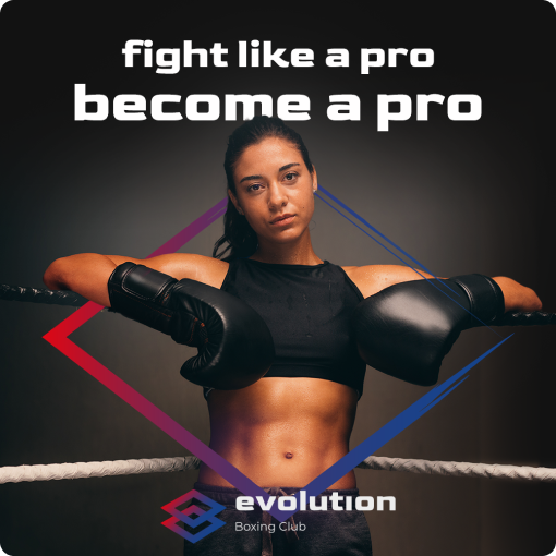
We created social media promotional posts to increase brand awareness and engage with potential members. These posts featured striking visuals with bold typography and incorporated the brand's colour palette to maintain consistency. The posts received positive feedback from followers and helped to increase the gym's social media following.


We created a merchandising collection called "Strings" based on the symbol to help reinforce the brand identity. This collection included various items such as t-shirts, hoodies, boxing gloves, gym bags, and shorts. We wanted to create a collection that was not only stylish but also functional and practical for members to wear during their workouts.


Since the implementation of the new branding and naming project, Evolution Boxing Club has experienced significant growth in terms of membership and overall brand presence. The visually striking logo and strong brand messaging have helped to attract new members who are drawn to the gym's focus on personal growth and self-improvement. In addition, the versatile design of the logo has allowed the gym to maintain a consistent brand image across all platforms, from social media to physical merchandise.
This project has demonstrated the importance of aligning the concept and name with the core message and mission of the company, as well as with the values and aspirations of its target audience. The use of typography and symbols can greatly enhance the visual identity and communicate the brand message effectively. Additionally, the flexibility of the brand in adapting to different environments and situations is crucial for its growth and success. Overall, this project has shown that a well-designed and thoughtful brand identity can make a significant impact on the growth and success of a company.